
Nuvioo CRM Profile Dashboard
My first dive into CRM design: transforming a fragmented customer profile into a unified, scannable interface that supports teams work faster and smarter.
Role: UI/UX Designer
February 2025-February 2025
When I came across the Nuvioo design challenge, I saw it as an opportunity to step into unfamiliar territory. I had never worked on a CRM system before, but that's precisely what drew me to a chance to learn a completely new domain and solve real problems for teamnd confidently
Project Background and Personal Journey
Problem
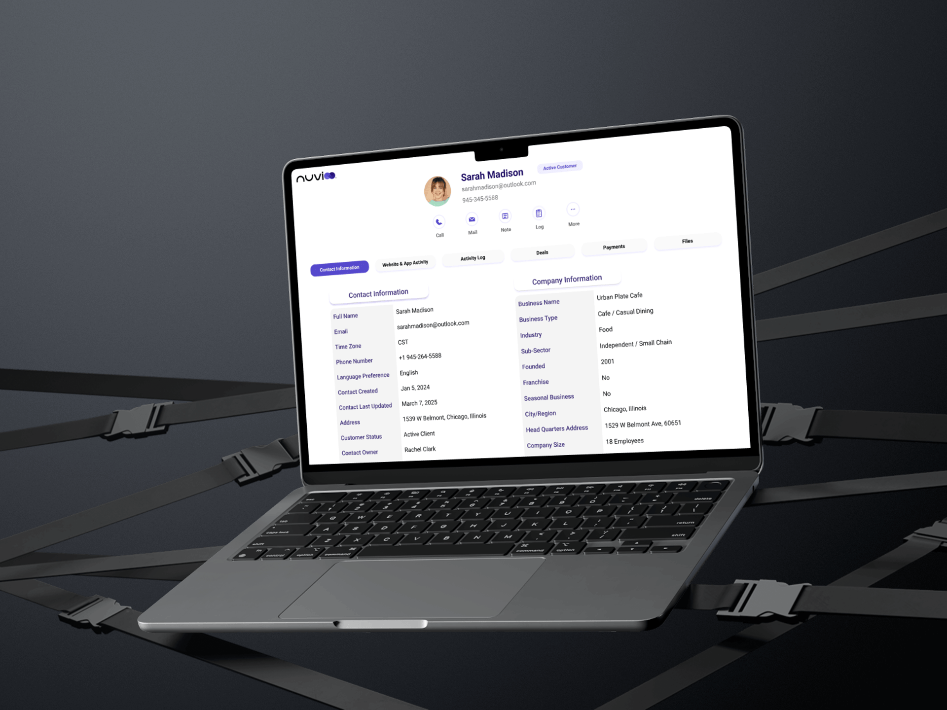
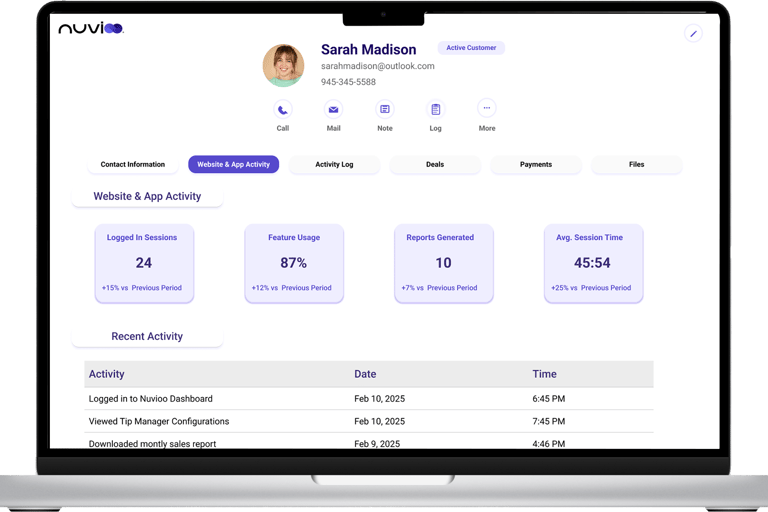
Nuvioo, a restaurant-focused CRM platform, needed a customer profile dashboard that brings together contact information, platform usage, and support history into one streamlined interface. The current system forced support staff to hunt through multiple tabs and systems just to get basic customer context.


Research: Competitive and SWOT Analysis
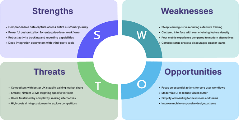
With only one week for this design challenge, I focused on understanding the CRM landscape through competitive analysis and user reviews on platforms like G2, Capterra, Reddit, and Trustpilot. I analyzed how leading CRM platforms organize customer profiles, what features users love and hate, and where existing solutions fall short. By studying HubSpot, Salesforce, Zoho, and Pipedrive, I identified common pain points that users repeatedly complained about cluttered interfaces, buried contact information, and excessive clicking to complete simple tasks. This research revealed clear opportunities to design a more streamlined, accessible customer profile experience."


Hubspot CRM
Salesforce CRM
Salesforce is the industry leader and most powerful CRM on the market, dominating enterprise sales with deep customization and robust features. However, this power comes at a cost—steep learning curves, cluttered interfaces, and user frustration with complexity
HubSpot is widely known as the beginner-friendly alternative to Salesforce, offering a generous free tier and integrated marketing tools. While it's praised for ease of use, users increasingly complain about feature bloat and rising costs as they scale.
Insights from User Reviews
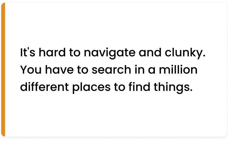
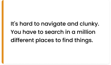
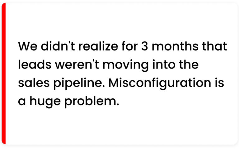
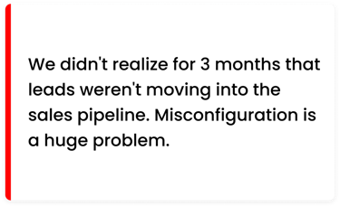
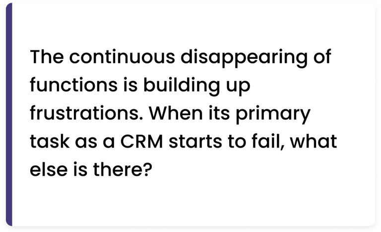
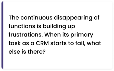
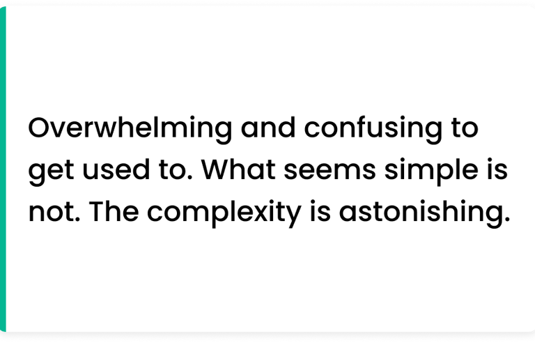
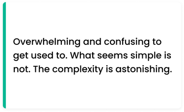
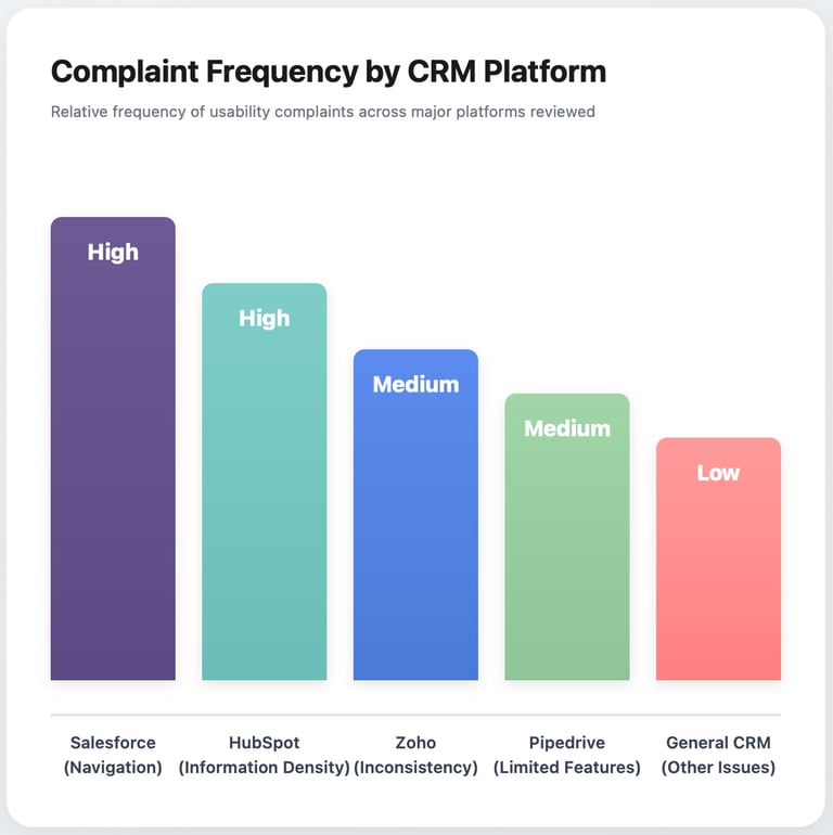
I analyzed hundreds of CRM user reviews on G2, Capterra, Reddit, and Trustpilot to understand real pain points and frustrations. These authentic voices revealed common patterns across different platforms from navigation complexity to scattered information that validated the core problems I set out to solve. The quotes below aren't cherry-picked complaints; they represent recurring themes that appeared consistently across multiple platforms and competitor products.
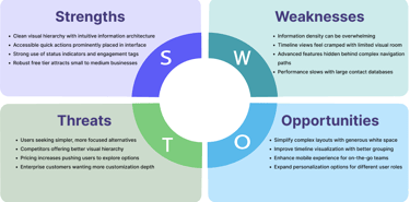
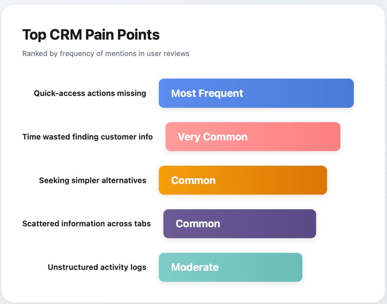
Research Takeaways
After synthesizing insights from competitive analysis and user reviews, five clear patterns emerged that would guide every design decision moving forward. These weren't just minor annoyances, they were fundamental usability issues that directly impacted how quickly support teams could help customers. Understanding the relative severity and frequency of these problems helped me prioritize which pain points to address first in the redesign.

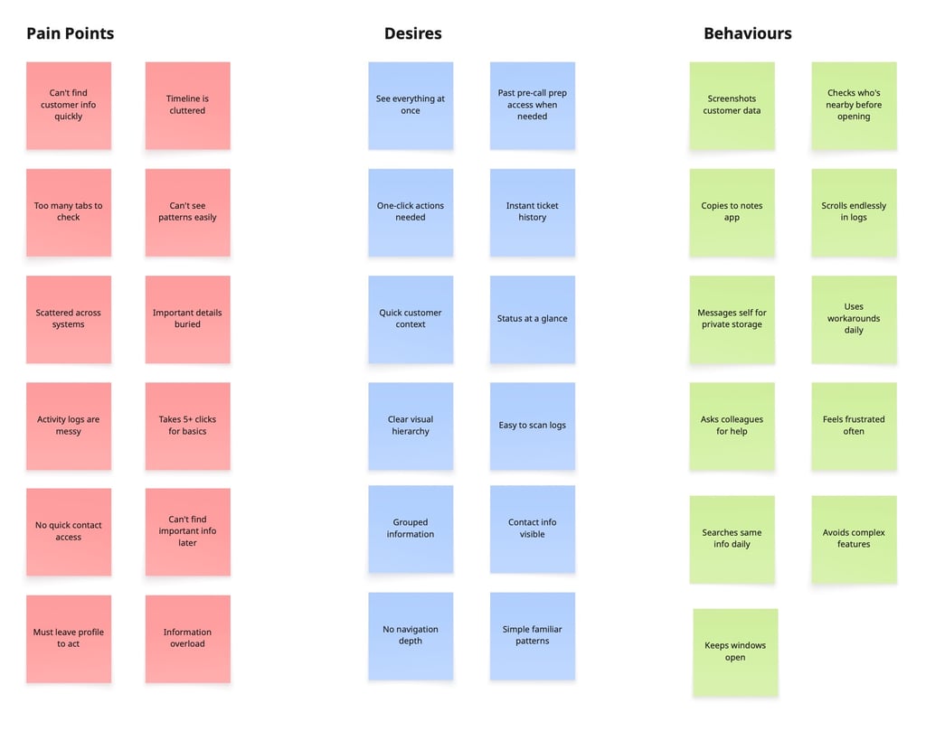
Card Sorts & Affinity Mapping
To make sense of the dozens of pain points, desires, and behavioral patterns I'd gathered, I organized them using affinity mapping. By clustering related insights together, three overarching themes emerged that went beyond surface-level complaints to reveal deeper user needs. These themes—Need for Speed, Context is King, and Simplicity Wins—became the foundation for every design principle and feature decision that followed.
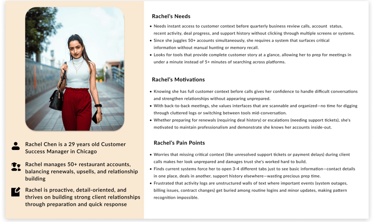
Meet the users: Personas, Task flows & Journeys
While I didn't have direct access to Nuvioo users, I developed two research-based personas representing the primary user roles who would benefit most from a better customer profile interface. Rachel and Jason aren't fictional characters—they're composites built from real job descriptions, review complaints, and common CRM usage patterns I observed during research. These personas kept me grounded in actual user workflows rather than idealized scenarios throughout the design process.


Exploration, Ideation: Wireframes
With a clear understanding of user needs and pain points, I began translating research insights into tangible design solutions. I started with low-fidelity paper sketches to explore different approaches without getting attached to pixels, testing ideas like sticky action bars, tab-based navigation, and various timeline layouts. The goal at this stage wasn't perfection; it was rapid iteration to eliminate bad ideas quickly and identify the most promising directions before investing time in high-fidelity design.


Design Iteration & Refinement
Without access to real users for testing, I conducted multiple rounds of self-critique and heuristic evaluation to identify potential usability issues before they became problems. I walked through common user tasks as both Rachel and Jason, noting every moment of friction or confusion. Each iteration removed unnecessary clicks, improved visual hierarchy, and brought the design closer to supporting the fast-paced, high pressure workflows that CRM users face daily. The refinements weren't arbitrary aesthetic choices they were deliberate solutions to specific problems I'd uncovered through research and testing.
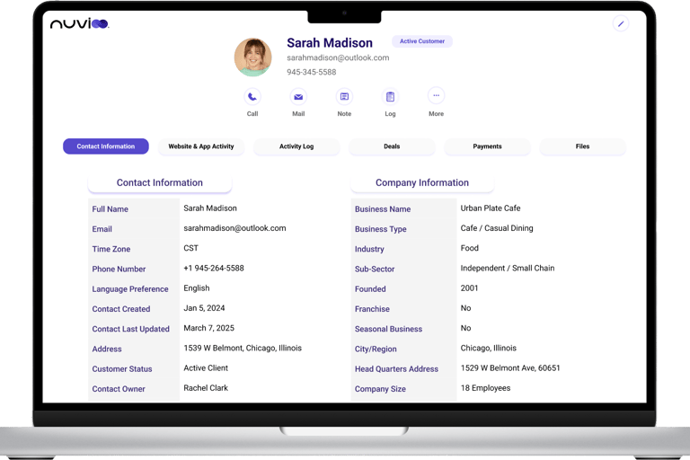
1.Contact Information Accessibility
PROBLEM
Phone and email were hidden in an expandable card, requiring users to click "Show more" to reveal contact details. This added unnecessary friction when support teams needed to quickly reach customers during urgent situations.
SOLUTION
Moved email and phone number to always-visible header position with integrated one-click Call and Mail buttons, eliminating navigation steps to access contact information.
2.Action Button Overload
PROBLEM
Displayed 8+ action buttons simultaneously (Call, Email, SMS, Note, Task, Meeting, Log, Activity, More), creating decision paralysis and overwhelming users who just wanted to perform one common action quickly.
SOLUTION
Streamlined to 5 essential actions (Call, Mail, Note, Log, More) based on usage frequency analysis from competitive research, maintaining one-click access to 80% of common tasks while keeping interface clean.
3. Information Overload
PROBLEM
Everything stacked on one long scrolling page—contact info, company details, activity log, deals, payments, and files—forcing users to scroll extensively to find specific information.
SOLUTION
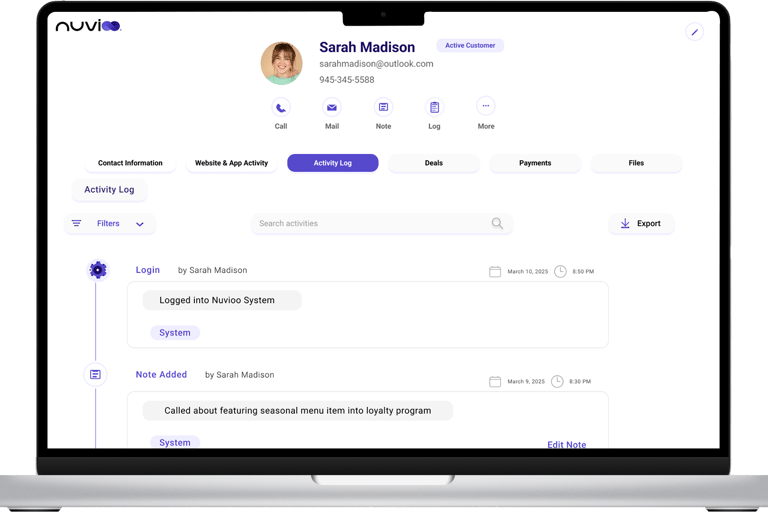
Organized into 6 clear tabs (Contact Information, Website Activity, Activity Log, Deals, Payments, Files) so users see only relevant data for their current task without visual overwhelm.
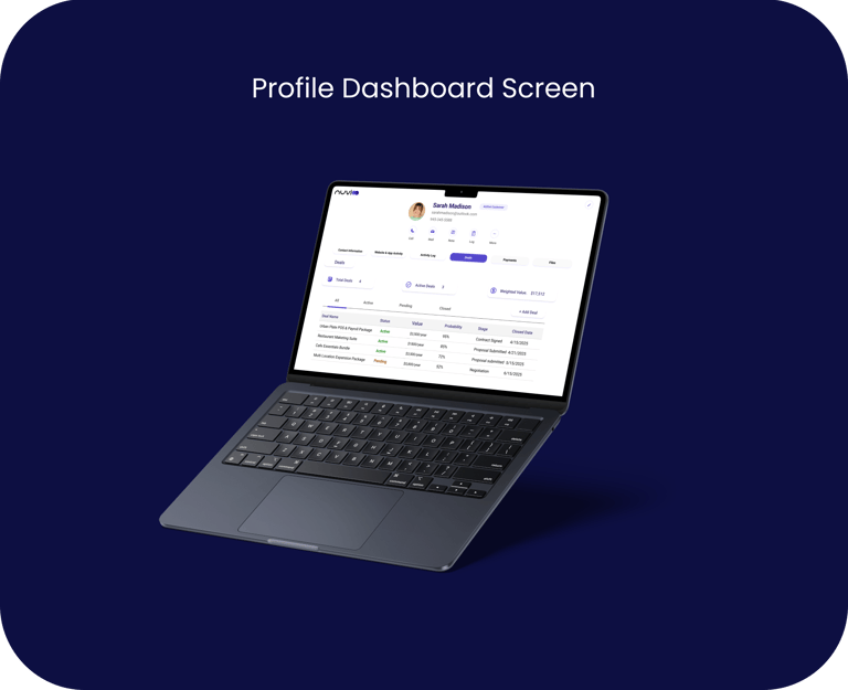
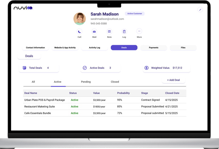
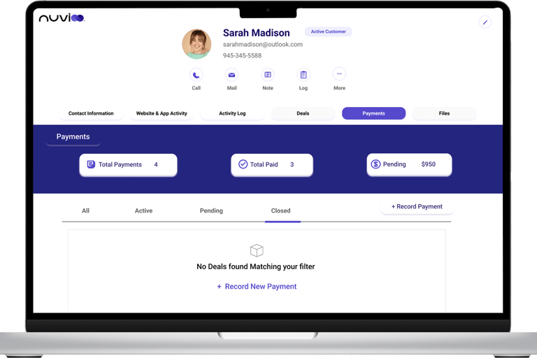
4. Data Table Filtering
PROBLEM
All deals and payments (active, pending, closed) shown in single table, forcing users to mentally filter or scroll through closed items to find current, actionable information.
SOLUTION
Introduced tab-based filtering (All, Active, Pending, Closed) with summary metric cards (Total Deals: 4, Active: 3, Value: $17,512) providing both filtering and overview context at a glance.
Learnings
What This Project Taught Me
1. Research Can Replace Direct Access
Without user interviews, I learned to extract valuable insights from competitive analysis, online reviews, and industry patterns. Deep research can guide good design decisions even without direct user access.
2. Design for the 80%, Not the 100%
I identified core daily actions through competitor analysis and optimized ruthlessly for those tasks. Call, email, note, and view history are what users do most—so those should be easiest.
3. Constraints Breed Creativity
A one-week timeline forced focused decision-making. I learned to prioritize ruthlessly and design with conviction based on research and established best practices rather than testing every assumption.
4. Visual Hierarchy Is Everything
Strategic use of typography, color, spacing, and layout transformed dense data into scannable, actionable information. The difference between cluttered and clear often comes down to hierarchy, not features.
5. Speed Is a Feature
Support environments demand immediate answers. Every click matters. Reducing navigation depth from 5 clicks to 0-1 clicks for common tasks isn't a nice-to-have—it's essential for teams working under pressure.
6. Real Users Would Make This Better
This design is based on research and best practices, but real usability testing would reveal blind spots and validate (or challenge) my assumptions. User feedback is irreplacable, and I would love to test this with actual support teams to refine it further.
7. Domain Expertise Can Be Learned
I entered this project with zero CRM experience, but treating it as a learning opportunity rather than a limitation helped me approach problems with fresh eyes and question conventions that experienced CRM users might accept.